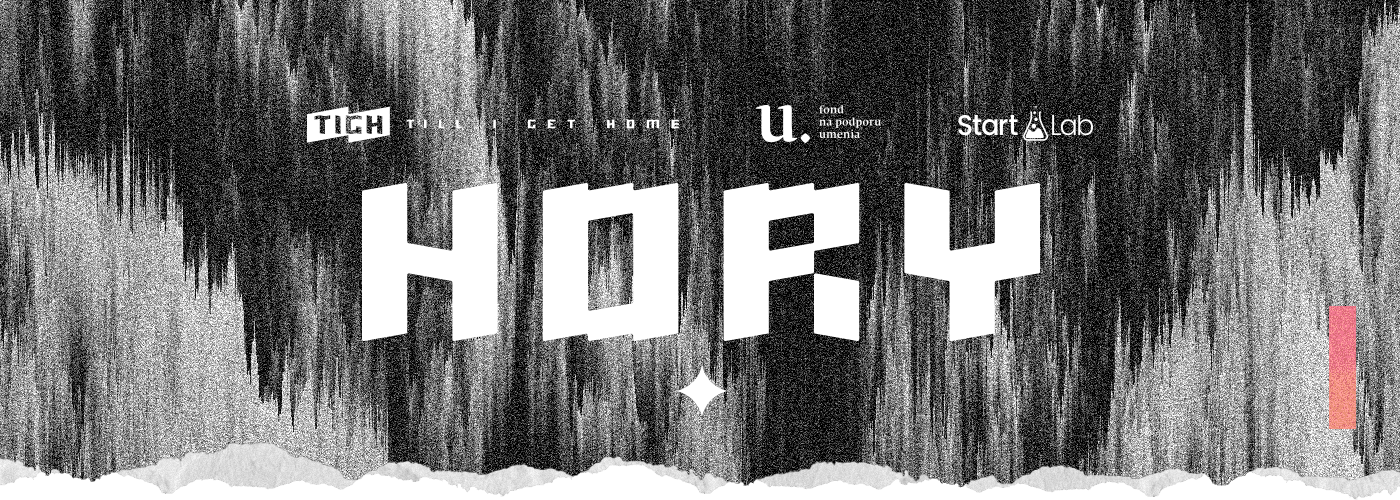
Hory (Mountains)
First full album by Till I Get Home
-
Client
Till I Get Home Music - Year
2022 - Category
Album cover and visual identity
Problem
The album Hory (transl. Mountains) is the band Till I Get Home's first complex work. Dirt, noise, granularity, coarseness, ferociousness, and chaos. The hardships and obstacles that one meets on life´s journey. And the ways to overcome them. All of this expresses the main motive of the album. The work's visual representation is also meant to communicate these things.
Solution
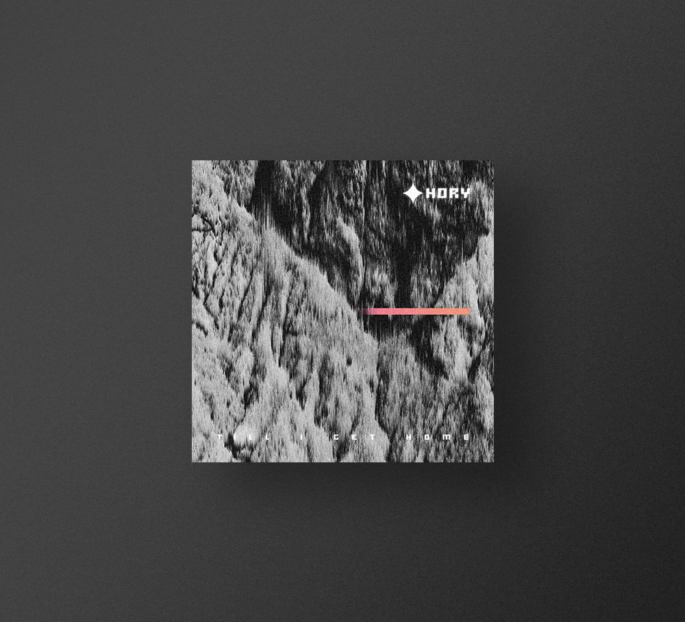
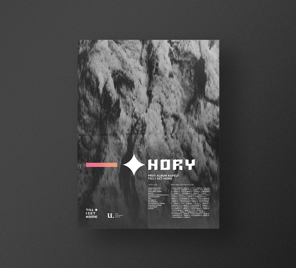
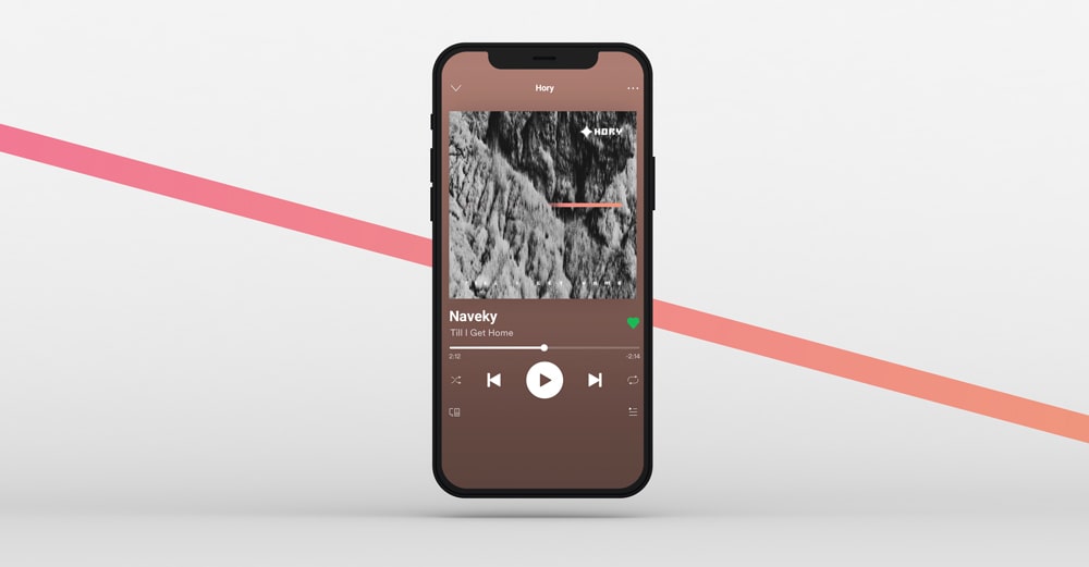
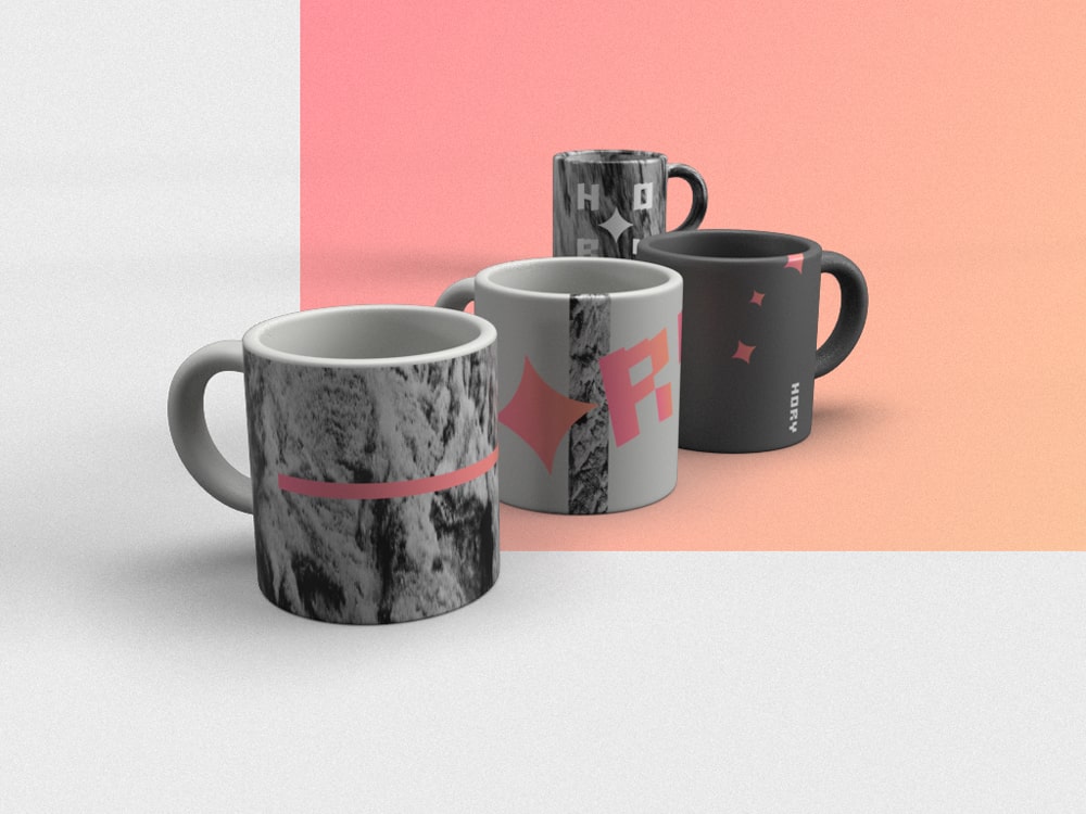
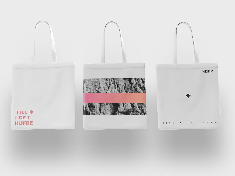
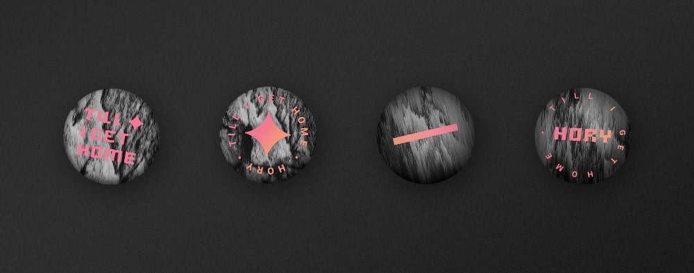
I realized that I wanted to start from something real, nonsynthetic. I chose a photo that captures a rock texture (author Dávid Mathé) and modified it using the pixel sorting method. The deformation adds a coarse, dynamic character and also brings a clear digital tone to the design. A similar analog and digital sound mixture appears in the album's music.
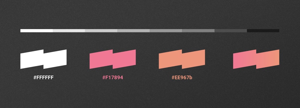
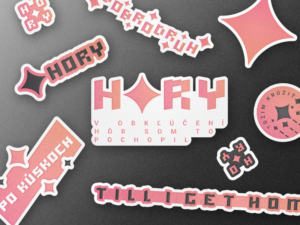
The dark shades of gray with white text (typical for Till I Get Home) are enriched by accent colors: apricot orange, and pink. Their gradient is applied to a thin line. This represents victory and order. A small amount of the warm-colored gradient is enough to create a contrast to the chaos that is happening in the background.
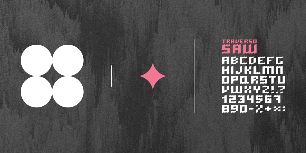
The logotype and its versions are composed of characters from my character set Traverso. It is complemented by a star, which represents something good at the top of the mountains of our lives. I tend to express things using a greater degree of abstraction, not directly. For this reason, I chose a star. In this case, it is not as obvious as for example a mountain symbol.