Till I Get Home Music
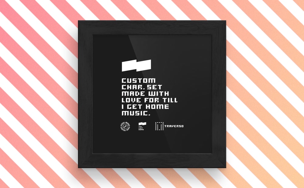
Visual style for music band Till I Get Home. Set of characters Traverso.
-
Client
Till I Get Home Music - Year
2019 - Category
Logotype and visual identity
Problem
The band Till I Get Home creates alternative music, combining elements of electronic sound with the sound of traditional musical instruments. Their visual style should be based on minimalism and make a more technical impression. The goal is to captivate with simplicity and clean lines and to communicate, right from the beginning, that this is a serious project with profound thoughts.
Solution
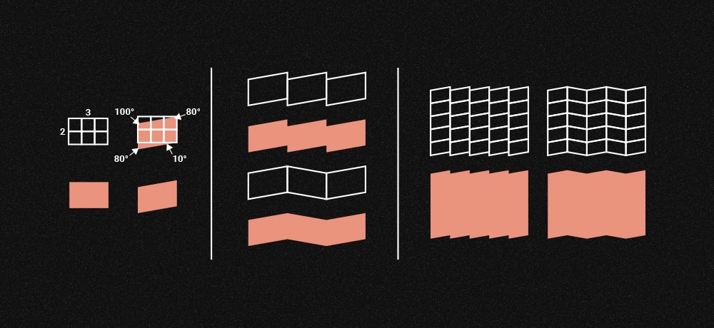
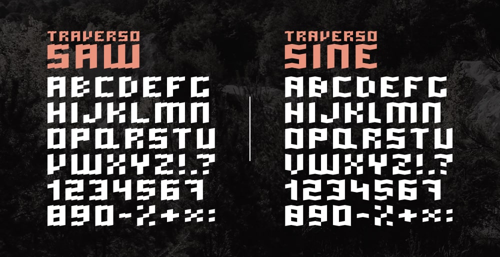
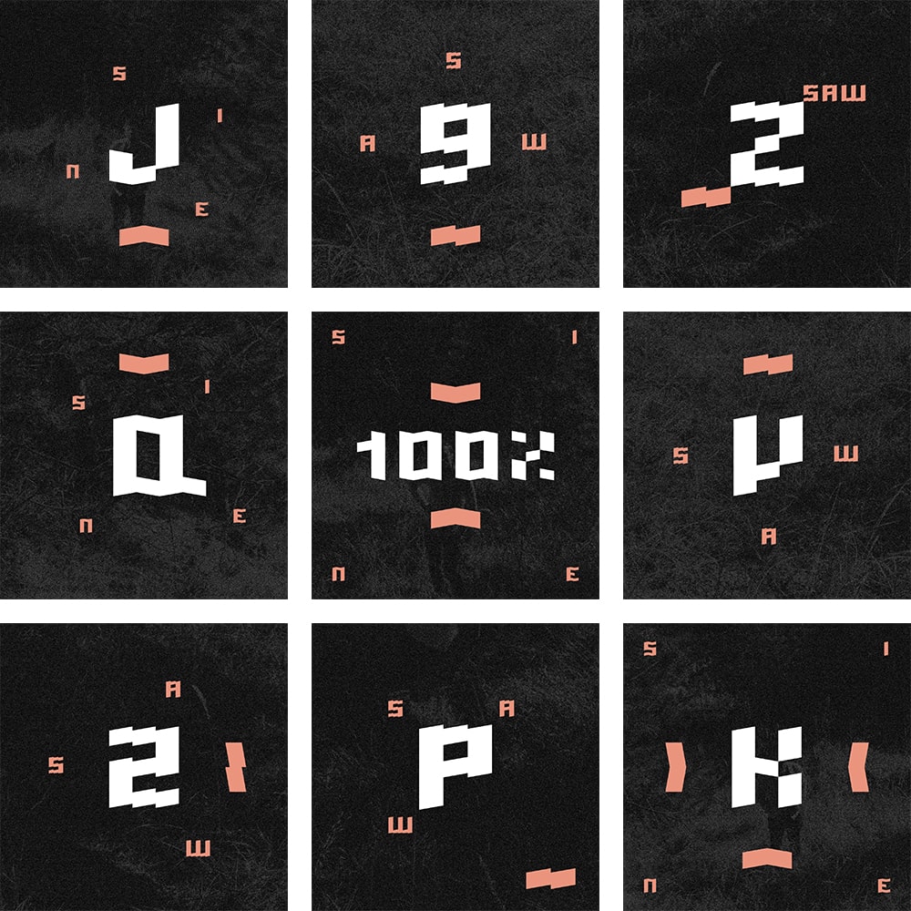
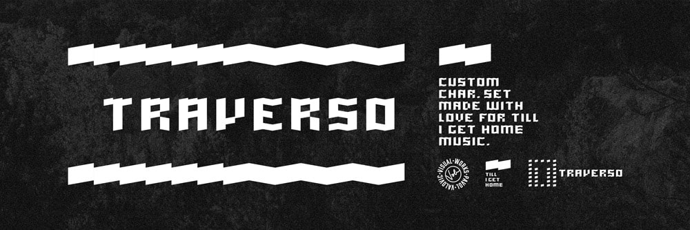
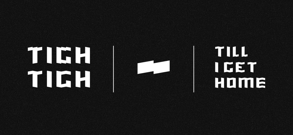
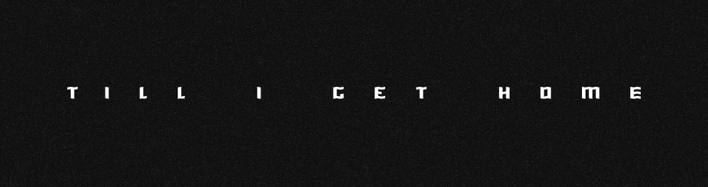
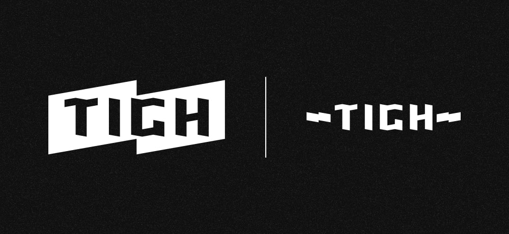
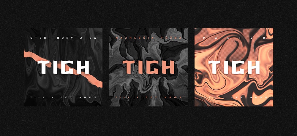
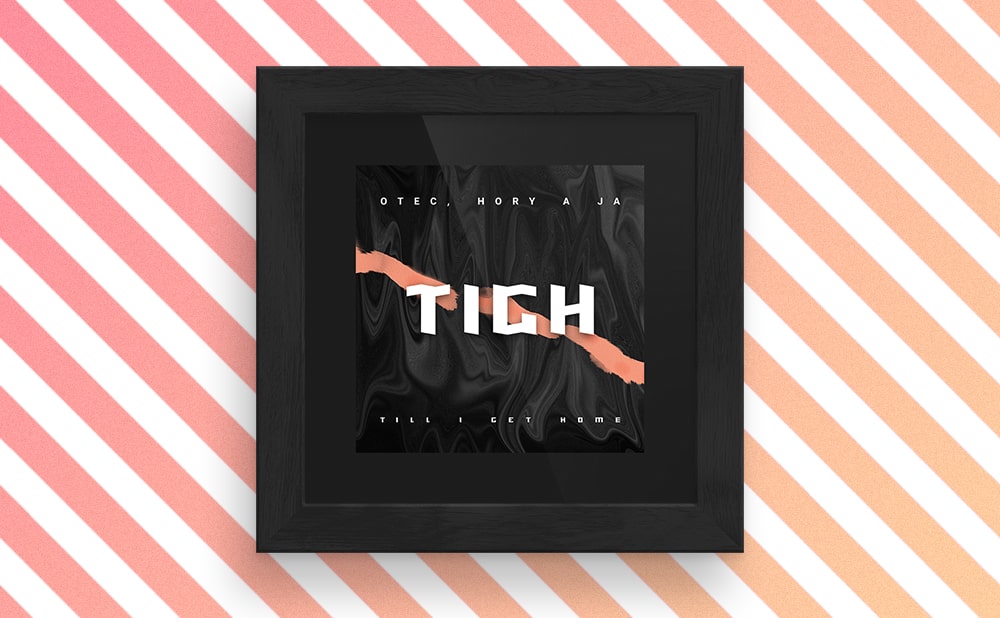
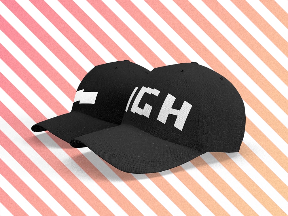
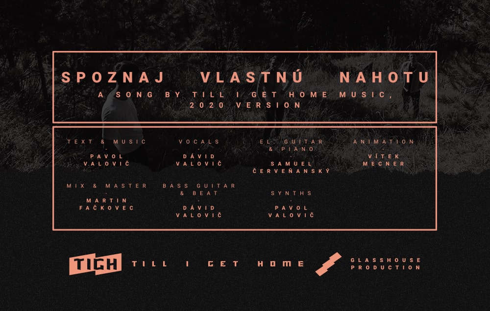
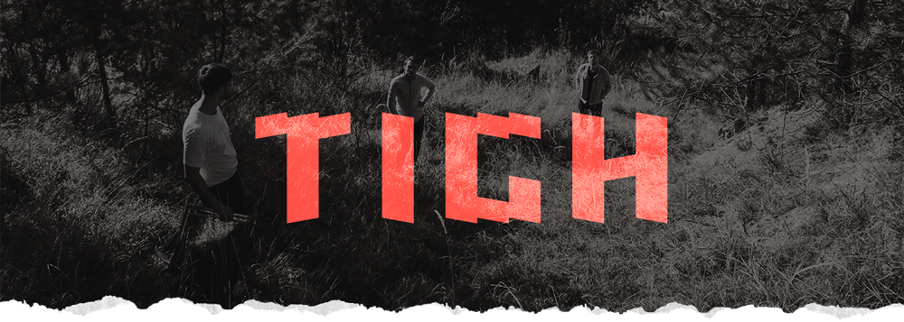
When designing the logotype, I reached for angular geometric shapes. I came up with a simple but impactful visual expression based on a rectangle deformed into a rhomboid. This shape became the fundamental building block for the set of characters that I named Traverso. Traverso evokes ferocity, immediacy, and clarity.
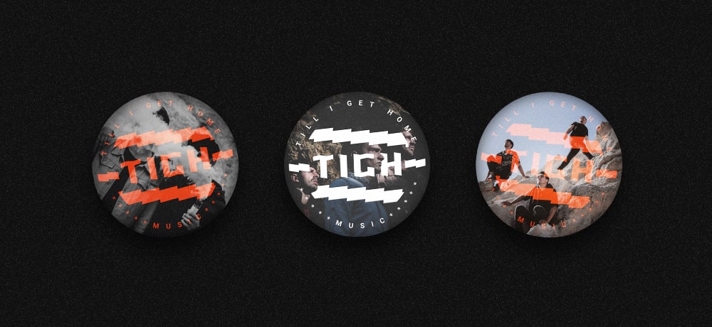
The color scheme is characterized by the use of dark tones, dominated by black (and dark gray shades) on which white objects are placed. This promotes simplicity and moderation. However, I added an accent apricot-orange color that represents playfulness, life, and passion.
Photo credit: Dávid Mathé