Valovic Visual Works
New style for my personal brand
-
Client
Valovic Visual Works - Year
2022 - Category
Visual identity
Problem
When I started preparing the valovicvisualworks.com project, it was clear to me that I need a new visual style built from scratch. I wanted my portfolio to look good, to be simple, and to communicate thoughts well. So I needed a proper style that could meet these needs.
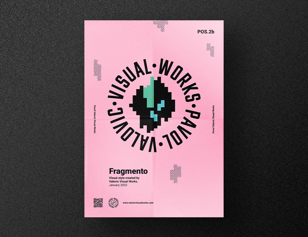
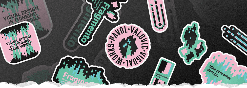
Since my early years in the field of visual design, I have been using my signature as my logo. And I wanted to keep it that way. Yes, I was quite nostalgic about it, I admit, but on the other hand, I was willing to alter everything else.

Solution
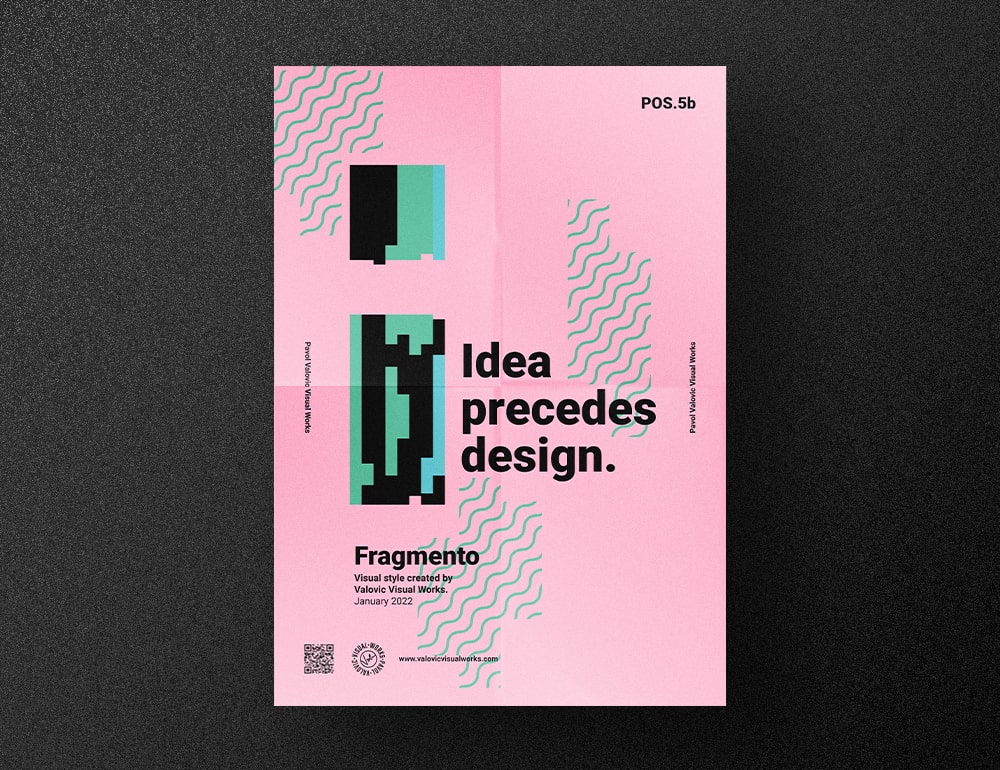
First, I was looking for an idea, a slogan that would help me highlight the most important aspect of my work. That is to visualize ideas. I would say that I was even searching for some sort of philosophy.
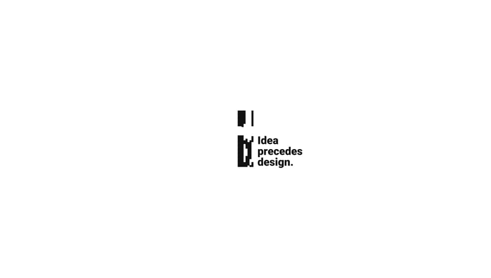
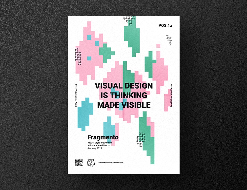
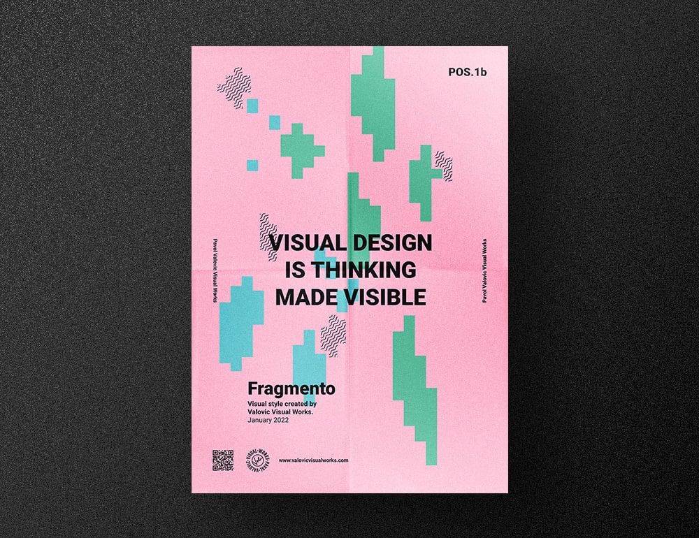
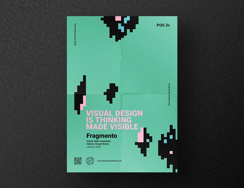
I believe that everything starts with an idea. I believe that the idea precedes design. In fact, design is a visualized idea. So it’s no surprise that this brilliant quote from Saul Boss captivated me: "Design is thinking made visual". A very truthful sentence. I loved it, especially because thinking is one of my favorite activities.

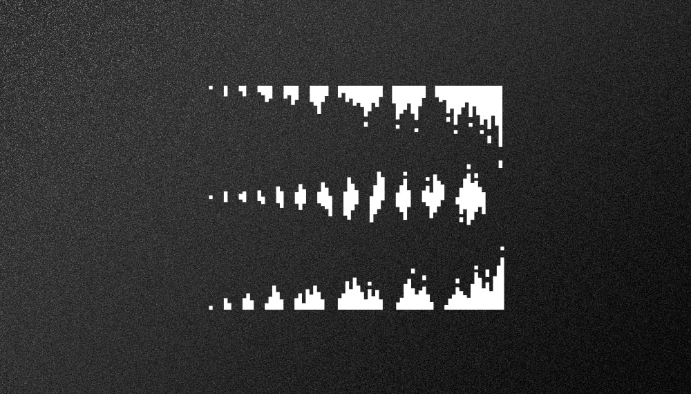
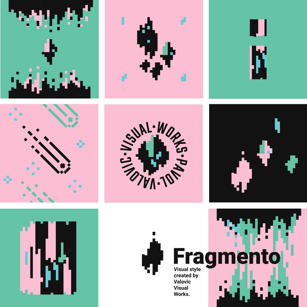
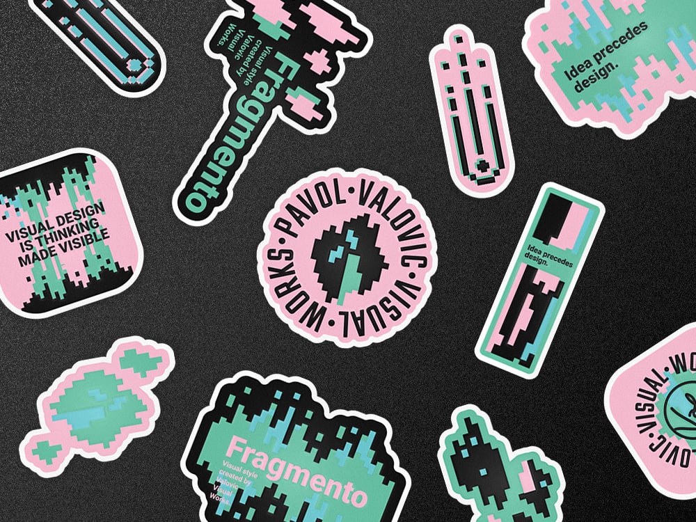
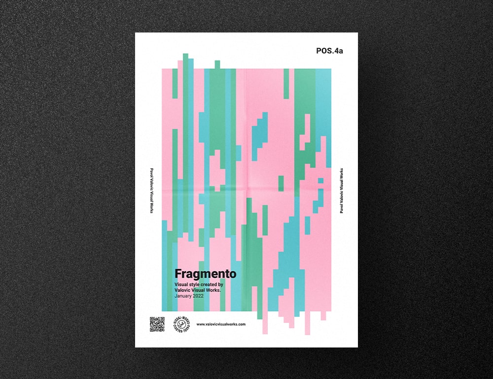
I chose a few pastel colors and also a font close to my heart — Roboto (in combination with Teko, for the logotype needs). I decided to put together rectangles of the same width but different heights. They form various design units. These are reminiscent of some kind of pixel-art style (which I really love) and I used them as a means of expression in my new visual system called Fragmento. Fragmento units can be small and simple but also more complex and form larger, sophisticated concepts. They represent the fragments of thoughts in my mind.